Note:- Click on images to inlarge it.
Before starting my streetphabets project we had to start looking at certain photographers to have better knowledge about street photography and being creative. Below are some of the well know artist which I looked upon before starting my Streetphabets project.
Shirin Neshat
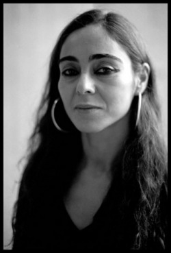
Shirin Neshat is an Iranian Visual Artist.Neshat creates strong visual contrasts using light and dark, black and white. I think this is to symbolise the two different cultures she can relate to: ‘West’ and ‘East’. I have found her work to be quite inspiring and interesting as she deals with her conflicting identities as she is an Muslim but living in America.She reflects the conflicts of her identity in her works.
Her work is inspiring, more so, for me because she’s a woman, women in the design world are rare and to see how well she has done for her is inspirational. Also I like how she uses her culture to inform her work. In Most of her works she uses black and white strong contrasts with the use of Iranian letters in most of her works. Also she uses the use of gun in most of her works to represent that she is trying to show the effect of voilence in her art work. Theses are some of her signature art style which makes her one of the unique Visual artist which Inspires alot of people.elf.
Her work is inspiring, more so, for me because she’s a woman, women in the design world are rare and to see how well she has done for her is inspirational. Also I like how she uses her culture to inform her work. In Most of her works she uses black and white strong contrasts with the use of Iranian letters in most of her works. Also she uses the use of gun in most of her works to represent that she is trying to show the effect of voilence in her art work. Theses are some of her signature art style which makes her one of the unique Visual artist which Inspires alot of people.elf.


Jasper Johns
Jasper Johns, Jr. is an American contemporary artist who works primarily in painting and printmaking. He is represented by the Matthew Marks Gallery. He is best known for his painting Flag, which he painted after having a dream of the American flag. Johns' breakthrough move, which was to inform much later work by others, was to appropriate popular iconography for painting, thus allowing a set of familiar associations to answer the need for subject.
Jasper Johns is also very Well known for his abstract and pop art works. His " Zero through 9" Painting is of them in which his idea of using the number sequence as the basics helps dictates the structre and way of the painting. The Experimentation of different colours and thickness is used in this paintings. Johns Uses the numbers as basis for his painting and also use of various bright colours which makes this painting one of his finest works.
Jasper Johns is also very Well known for his abstract and pop art works. His " Zero through 9" Painting is of them in which his idea of using the number sequence as the basics helps dictates the structre and way of the painting. The Experimentation of different colours and thickness is used in this paintings. Johns Uses the numbers as basis for his painting and also use of various bright colours which makes this painting one of his finest works.


Saul Bass

Saul Bass
Saul Bass is one of the most popular Graphic Designer of his time in the 20th century, his works inspired alot of people and still inspires the new generations.He is best know for his movie title's, but was also known for his graphic design, including movie posters and corporate identities. His work forms around solid colors, geometric layouts, montage, hand drawn type and dominant symbolism. The creativeness he used in the movie posters made the audience some knowledge about the they might expect from the movie. The use of Capital Bold Letters used in his works like 'Anatomy of a Murder', 'Vertigo', 'West side story', 'Saul bass exhibit' etc made it one of his signature style.
One of his most Known Work that I am most admired is the Film poster for the movie Psycho, In the Poster it has been designed with the use of black color in the background with the use of White and Red color for the letters used. The use of Black color in the background adds more mystery to the movie poster, It gives clear view to the audience that the movie is Dark, horror, and mysterious. Where as the use of the Red Color in the word Psycho symbolizes that the movie might contain Murder, Blood, Action and mystery. Even the Use of Cracked letters design in the word 'Psycho' adds more meaning to the word psycho. Cracked Design might also symbolize that it might about some one who is mentally ill or the deal of psychological issues in the movie.
The another Famous Work of him that I like is on 'The Man With The Golden Arm', for which Bass created the famous arm design, which suggests the existence of a drug addict, volience, mystery, horror and Blood. With this design, Bass exploited what he termed the significance of content in design. The Use of Red Bold letter for the word "The Man with the Golden Arm" symbolized that the Movie might contain Murder, Blood, and Mystery.


Barbara Kruger

Barbara Kruger (born 1945) is an American conceptual artist represented by Mary Boone Gallery, New York. Kruger has also had exhibitions at the Museum of Contemporary Art and at many places.
Kruger's graphic work usually consists of black-and-white photographs set in white-on-red Background Letter in the Middle.Her work are usually declarative,Black and white and make common use of such pronouns as "you", "I", "we", and "they".It was one of her signature letters which she uses quite often.
In one of her famous works that I like is "Thinking of you" the use of Black and white photograph has been used which is one of her signature style, The use of Big letter title "Thinking of You" written in White letters with Red highlight over the word. The Background picture of the poster contains a graphic scene of some ones hand getting pinned, which might suggest that he/she is missing some one badly and was desparate to meet him/her. Also the Title suggests the very same thing. The fact that she uses black and white pictures and uses Words and pictures to give audience a general view about the story of that Art which is inspiring.


