Note:- Click on images to inlarge it.
Streetphabets.
In this task of our photography course we had to take pictures of objects that take the same or similar shape to that of the 26 letters of the alphabet. This is my second project was called streephabet. In this Project we had to take a photograph for each letter of the alphabet which resembles to only natural objects such as Roads, floors,Doors etc.and we werent allowed to manipulate the object. We also had instructions that the same picture cannot be used twice purpose and the use of Outside photpgrpahy was incouraged. Below are my 26 letters and an analysis for each letter explaining in breif about the letters.
A - This Alphabet object picture was captured when I was Walking from school to my home in the road. The Image was captured in with Vertical angle in braod day light. While Taking the picture I had to Zoom in to the letter as much as I could because the Alphabet picture had lots of cracks around it .The Bad point about this image is the Crackers on the sides of the Image A which sort of takes the letter A image from image.
B- This B Resembling type of object is of designed plant holder which is usally found in peoples garden. The location of the picture taken at was at my garden, It was originally snapped in the vertical angle so that I could get the whole B on the camera screen, but then I realized that the picture was in opposite direction so with the help of photoshop I had to Flip the picture downwards to make it look actually like B. The down point about this Image is that the Background is not blurry so if I will have next chance I will try to get the Background blurry.
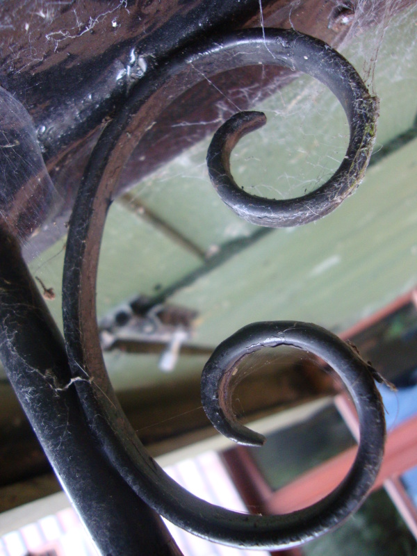
C - The Object on the left hand side of the an Metal decolarative design of my store house which kind of resembles to the letter C. My first Intention while taking the picture was to get It in a B letter position but later while looking at the picture more carefully I found the object more resmmebling to C then B. In this picture I again had to used photoshop to flip the picture Downward. The plus point of this Image is the Blurry background which helps users Focus on the Sharp C letter object.
D- The picture on the left is of plastic pipe outside my house, which Iam not sure what is it used for. The first Intention while capturing this picture was to get the picture of U but when I focused on the picture later on Computer D seemed more appropriate. The plus point of the Image is the blurry Background where as the back point of the image is that the image needs more cropping to get the unwanted backgrounds out of the image.
E - The Image on the left is of damaged wall made of wood which was captured outside Lampton School. The Image was captured in an vertical angle so that the whole of the E would fit in the camera.
F- The left Image is of tyles on the path of the Road, inside Inwood park. The Image was captured in a vertical angle. The Lines of the Tyle represent the letter F on the left Picture which I think good picture interms of creative point of view.
G- The Image on the left is was captured inside Lampton school and is of some decorative item. The Image looks more like L then G but as there was a steel plate on the ending of L it made it resemble more to G letter.The Image was again captured in vertical angle. The Photogprah would have looked better if not for the windows and bushes on its background.
H- The Picture on the left is of Wooden wall captured in location near to Lamtpon school. The Image was captured in a vertical angle on day broad sunlight which made the picture quality even better. My First Idea before taking this picture was to take it as an M which after I clicked it looked bad but Looked good H.
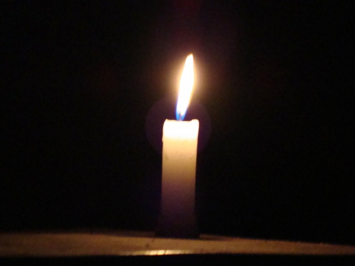
I- The Left Picture is of the Candle which resembles to the letter of alphabet Small I. The Base of the candle being the line and the fire acting as the dot in I. I never intended to capture this Image to get a letter out of it, While I was checking my images on the computer I figured out that From the creative point of view This image would Look great as I. The bad thing about this picture is that the quality of the picture is not so great which is the downpoint.
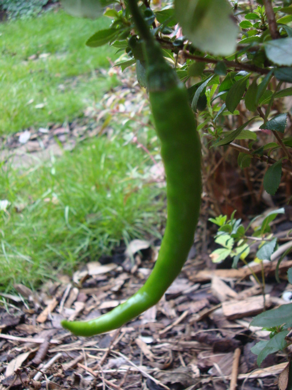
J- The Image on the left is of Chilli, Which was growing in the backyard of my house . The Image was captured in vertical angle and Had to zoom preety close to get more focus on the Chilli. But while focusing too much on it the Picture turned out blurry and not so great interms of quality. If given chance I would definately click another picture of it.
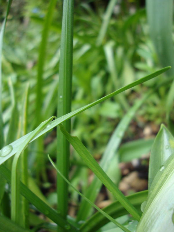
K-This image is Extreme close up shot of grass to represent K of the alphabhet.
L :- The Image on the left was captured of the Long steel and wooden playing thing. The Image was Captured in wide angle to capture the Whole letter L, then later I had to use Photo shop to change the image on the left direction to make the image look more like letter L. The down point of this Image was the non blurry House on the background.
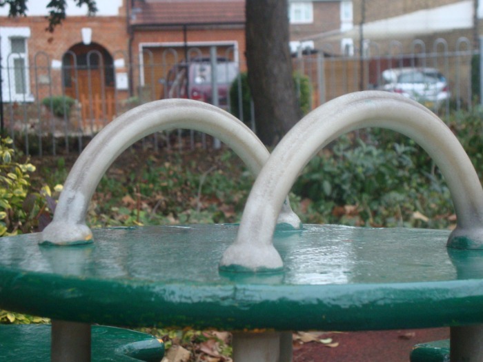
M- The image of M was captured inside the Inwood park. The M image is formed with the two curled metal rods which is captured from an angle through which it looks like M. The Image was Captured with close wide angled shot and blurrying the backgrounds adds more focus to the Primary Focus point which is the good point about the picture. Where as the backpoint about this image is the Huge background which helps is taking the focus out of the primary focus point.
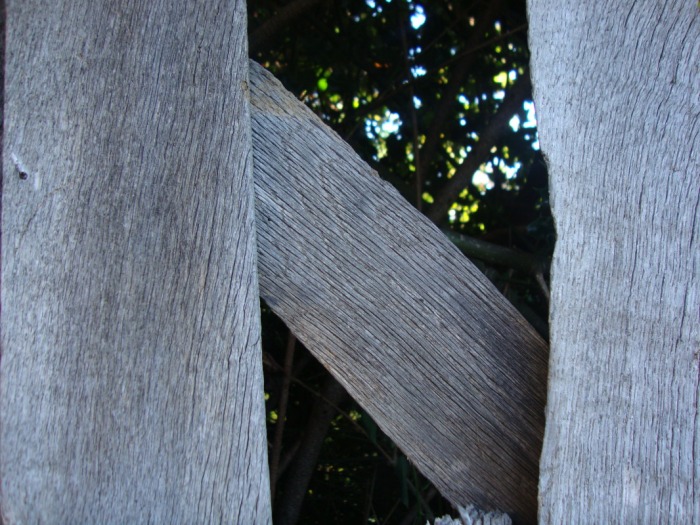
N- The Image on the left is of the wodden wall which was kind of old and in poor condition. One of the wodden wall had fallen off which give and image like N. I found this picture near the Hounslow East train station. The Image was captured in Narrow angled with close up zoom in. The good point about this image is that it gives viewers clear impression of what letter this image is of but the bad point of this image is the wide sides of the N, and the image is that very catchy nor with any WOW factor.
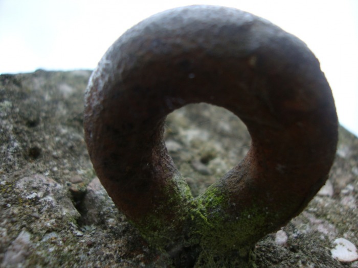
O- The Image on the Left is of an round Metal rod which was in one of the stands, the image was captured near Inwood park. The Good point about the Image is the close focus and catchy factor, where as the bad point about this image is that the picture seems blurry in the edges of the 'O' letter and also this image is a complicated O while viewing.
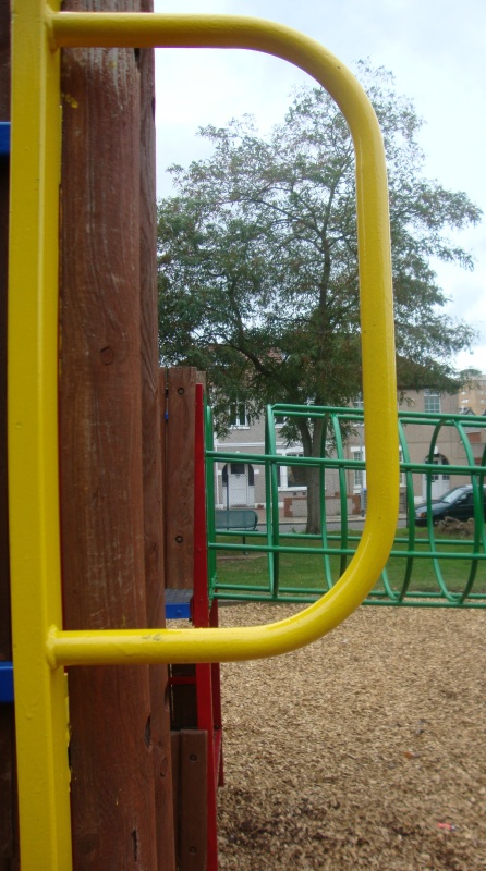
P- The Image on the left is of 'P' letter of the alphabet, the image was taken of metal rod which was attached to some playing thing in childerns play ground inside 'Inwood Park'. The Good point about the Image is the sharpness of the picture an also the fact that the image can be easily recogniseable as what the image looks like in form of Alphabet letter. The bad point of the image is the big back ground with trees and other playing things this takes the focus of the primary object away.
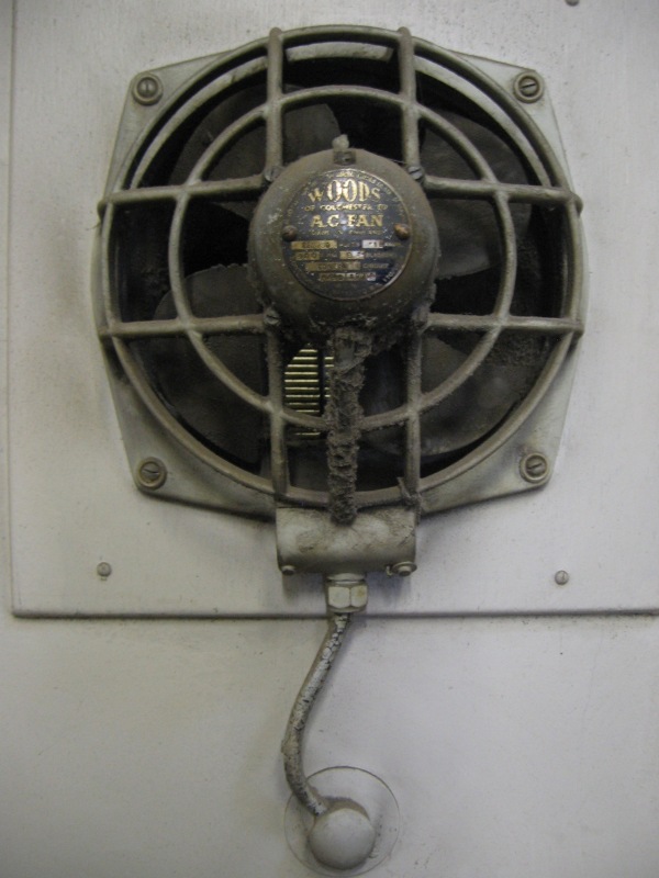
Q- The image on the left was Captured inside Lampton School and is of a Fan. The image was captured in narrow angle with close focus. In the Image the Head of the Fan acts as the 'O' of the Q letter and the Wire acts as the Tail which makes the Image look very well like like the Q letter of the Alphabhet. The good point about this image is it is sharp and gives audience clear view of which the image looks like in terms of letters where as the bad point of the image is it was clicked inside the room.
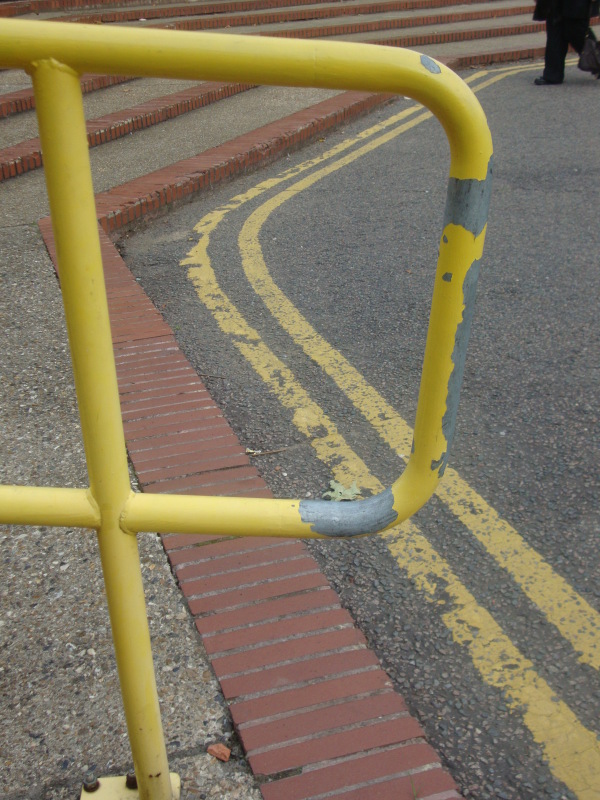
R- The letter on the left side is of the Metal Railing which was found just outside the Civic Center of Hounslow. The Image was first Intended to capture the letter P but I realized the pressence of the Yellow paintings on the floor which Helped to make the Image of letter R, which Seemed better then P from the creative point of view. The Bad Point about this image is that the man walking in the background of the image.
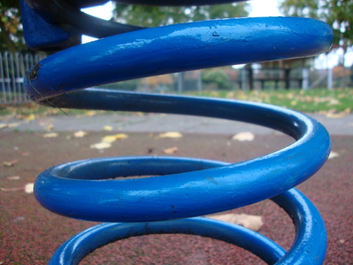
S- The Image on the Left is of the Metal spring which was found on the "Inwood park" Location. The Image was captured in wide angle in close zoom in, which made the image look more sharp and clear.The back point of this picture is that the middle part of the S is gone blurry and is not sharp, which takes the focus of the picture to view it as S.
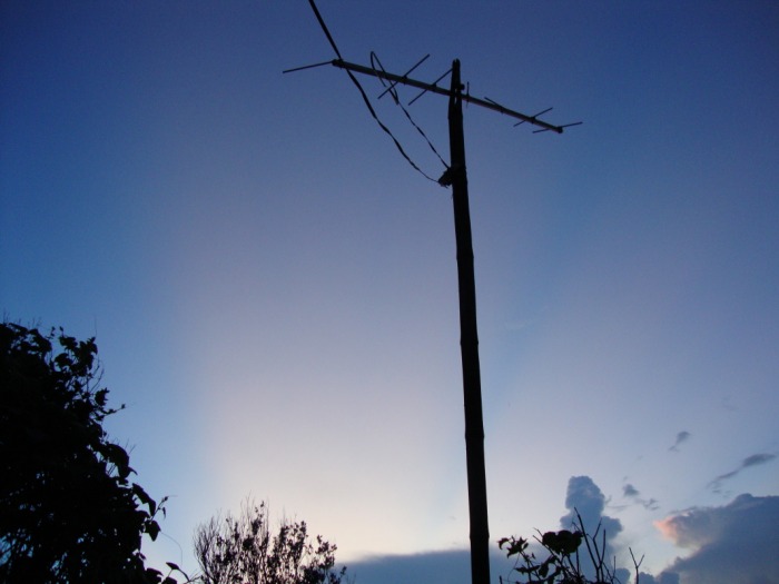
T- The letter 'T' was taken of a Antena of Telivision hanging from a pole.The Picture was Captured in Nepal while I was In Holiday, I never Intended To get letter out of this picture while taking it but while checking the picture out later I figured that It resembles to the Letter T of the Alphabet. I also like this picture because there is a good amount of natural lighting and considering this was taken from a far distance the quality of this picture is reasonably good.
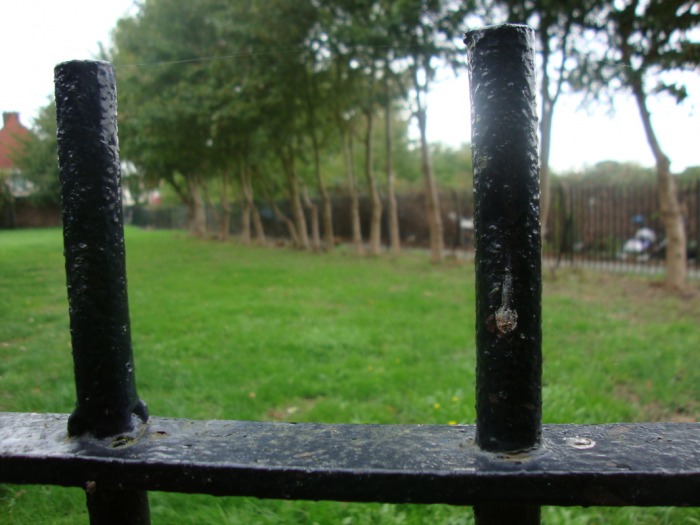
U- The Image on the left is of the Metal steel bar of "Inwood park" location. The Two Metal rods on the Image and the down Metal helps to represent the U letter of Alphabet. The Up point about this picture is the strong, close and sharp focus on the Primary object and the blurry of the background. Where as the Down point about this Picture is the extended railings on the left and right which kind off takes the U out of Picture. Using Photoshop next time should resolve this Problem.
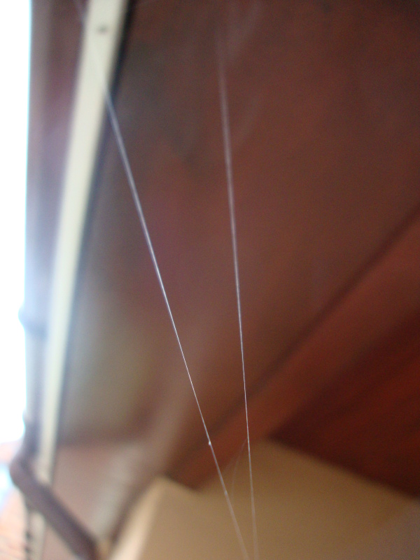
V- The image on the Left is of the Spider web which was hanging just outside my house. The First Time I saw the Image I knew I would get something out of it. As the Spider net was high above I had to Climb in the stool to get better image out of it. I like then fact that there is a good amount of natural lighting and considering this was taken from a far distance with Zoom in the quality of this picture is reasonably good which is the up point of this picture.
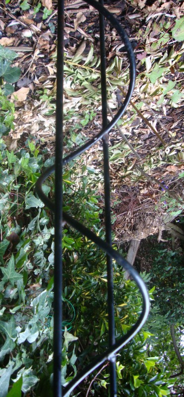
W- The Image on the Left is of The letter W of the alphabet, which was found in my home garden. The Wooden sticks that represent W in the Picture were the designed Plant holder for which I had to Zoom in and still had to use Photo shop to crop the image to Make the Image look for Like W. The image had to be captured in Wide angle direction to get the full view of W.
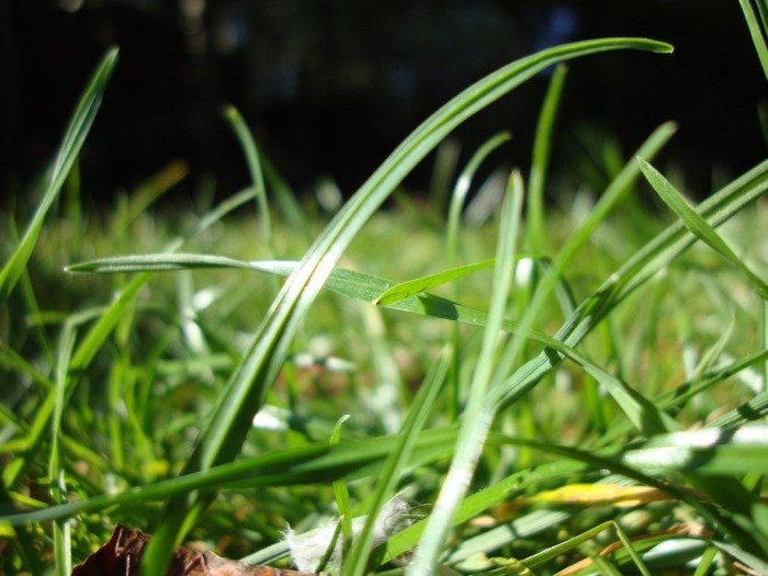
X - The image on the left is of Green grass of my garden which resembles to the letter of Alphabet X. The two leaves of the grass helps to form the letter X. The Image was captured in an wide angle in broad sunlight. I like the fact that the leaves denoting the X on the picture is Sharp where as the background is blurry which helps us to focus more on the 2 leaves then background. The Bright sunlight Lighting in the middle of the two leaves adds more quality to the picture.
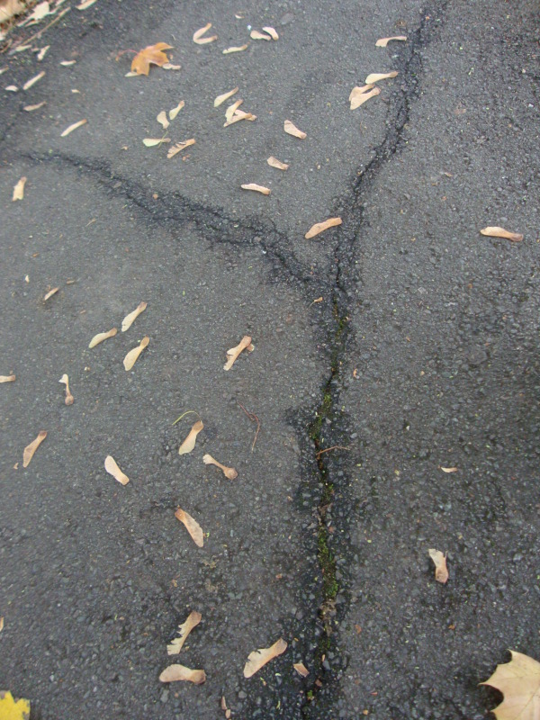
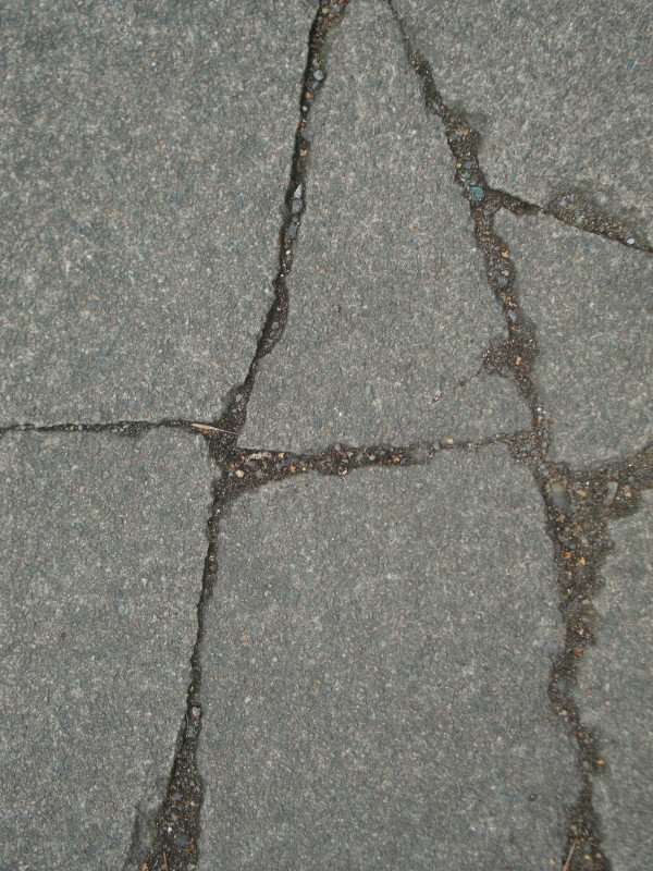
Y - The image on the left is of the Crack on the Road which I have used to represent the Y letter of Alphabet, The image was found on the Road of "Inwood Park". The Close Vertical angle shot of this picture made the Image clear. The good point about this image is the black water lines on the crack of the letter Y of the Alphabet.
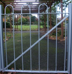
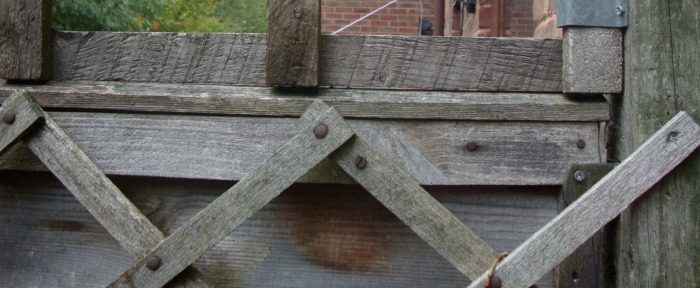
Z - The Image on the left is of the door of the inside of the "Inwood park". The Gate railing of Zig-Zag position helps to represent the Z letter of alphabet.
Evaluation :- Streetphabhets was the second project that we did in our As - photography class. My primary objective was to capture 26 Alphabet letters which resembles to only natural objects such as Road, Door, Plant, etc. My time management while doing this project was not good due to which I did not have enough time to Replace all my bad images that I didn't like. Letters such as Z, Q, B, and E would be the main pictures that I would replace if I was to improve. But some of the pictures like of I, K, R, X, T, and V were my favourites among the 26 alphabet pictures above. Overall I really enjoyed doing this project and was happy with my final results.
